There are a plethora of slider plugins already available for WordPress but yet I couldn’t find one that matched all my needs such as:
- Gutenberg ready (preferably with block interface for set up)
- Easy to use and intuitive
- Able to be sized to full width and height as percentage of viewport
- Slides to contain an image with some elements overlaid (headings, text, button/link)
- Don’t want to use a pro/paid version of a plugin
So I just put together one myself with Lazy Blocks and Swiper.js. I found it was very easy to do and makes a great highly configurable solution that you can tailor to your exact needs so I thought I would share it here.
What is ‘Lazy Blocks’?
Lazy Blocks is a free plugin for building custom blocks. I love this plugin, it is very powerful but yet easy to use. I’ve been using it for many years. A typical use would be for something like what I would have used a shortcode for in years past. So instead of having a shortcode that you have to remember the name of and what attributes it takes, you now have a block with a user interface for whatever settings are needed. Much better for me and my clients! You do need to be familiar with coding to use it though so it’s not for people who are totally adverse to coding.
What is ‘Swiper.js’?
Swiper. js is a modern JavaScript general purpose slider script. It can be used for creating touch-friendly sliders and carousels. It is used as the ‘engine’ by many of the slider plugins available for WordPress.
Step 1 – Get the required Swiper.js files and place them in your theme
When building websites for my clients I usually build my own custom themes rather than using commercial of free themes, so my approach is to bundle the Swiper code in the theme. If you are using a commercial theme, you can also do the same in your child theme. You can place the Swiper files wherever makes sense to you but here’s where I put them:
- swiper-bundle.min.js – place in [theme folder]/assets/scripts
- swiper-bundle.min.css – place in [theme folder]/assets/css
Step 2 – Enqueue Swiper script and CSS
This is done in functions.php.
function sww_enqueue() {

	// enqueue Swiper script and CSS
	wp_enqueue_script('swiper-min', get_template_directory_uri() .'/assets/scripts/swiper-bundle.min.js');
	wp_enqueue_style('swiper-css', get_template_directory_uri() . '/assets/css/swiper-bundle.min.css');

	// enqueue the theme's main Javascript file
	$filetime = filemtime( get_stylesheet_directory() . '/themescripts.js'); // for cache busting
	wp_enqueue_script('sww-themescripts', get_template_directory_uri() .'/themescripts.js', array('jquery'), "$filetime", true);
}
add_action( 'wp_enqueue_scripts', 'sww_enqueue' );
You will notice that in addition to enqueueing the Swiper script and CSS, I have also enqueued themescripts.js. This is my theme’s main Javascript file. If you are working with a child theme you may not have one so just make blank Javascript file. I name mine ‘themescripts.js’ but you can name it whatever you want. We will need this for the next step.
Step 3 – Initialise Swiper
This is done with some JavaScript code. I place this in my themescripts.js file mentioned in previous step, but you can place it wherever makes sense in your case. I place it inside a jQuery(document).ready() so that it executes when all assets are loaded. Your code will depend on what features and settings you want to activate in Swiper. There are many options so you may need to refer to the Swiper docs for your own particular needs. But here is an example for my slider:
jQuery(document).ready(function( $ ) {
   // Initialise Swiper
	const swiper = new Swiper('.swiper', {
		// Optional parameters
		autoplay: {
			delay: 7000,
		},
		effect: 'slide', // Transition effect. Can be 'slide', 'fade', 'cube', 'coverflow', 'flip', 'creative' or 'cards'
		speed: 1000,
		// Navigation arrows
		navigation: {
			nextEl: '.swiper-button-next',
			prevEl: '.swiper-button-prev',
		},
		loop: true
	});
}
Step 4 – Create a custom block for your slider
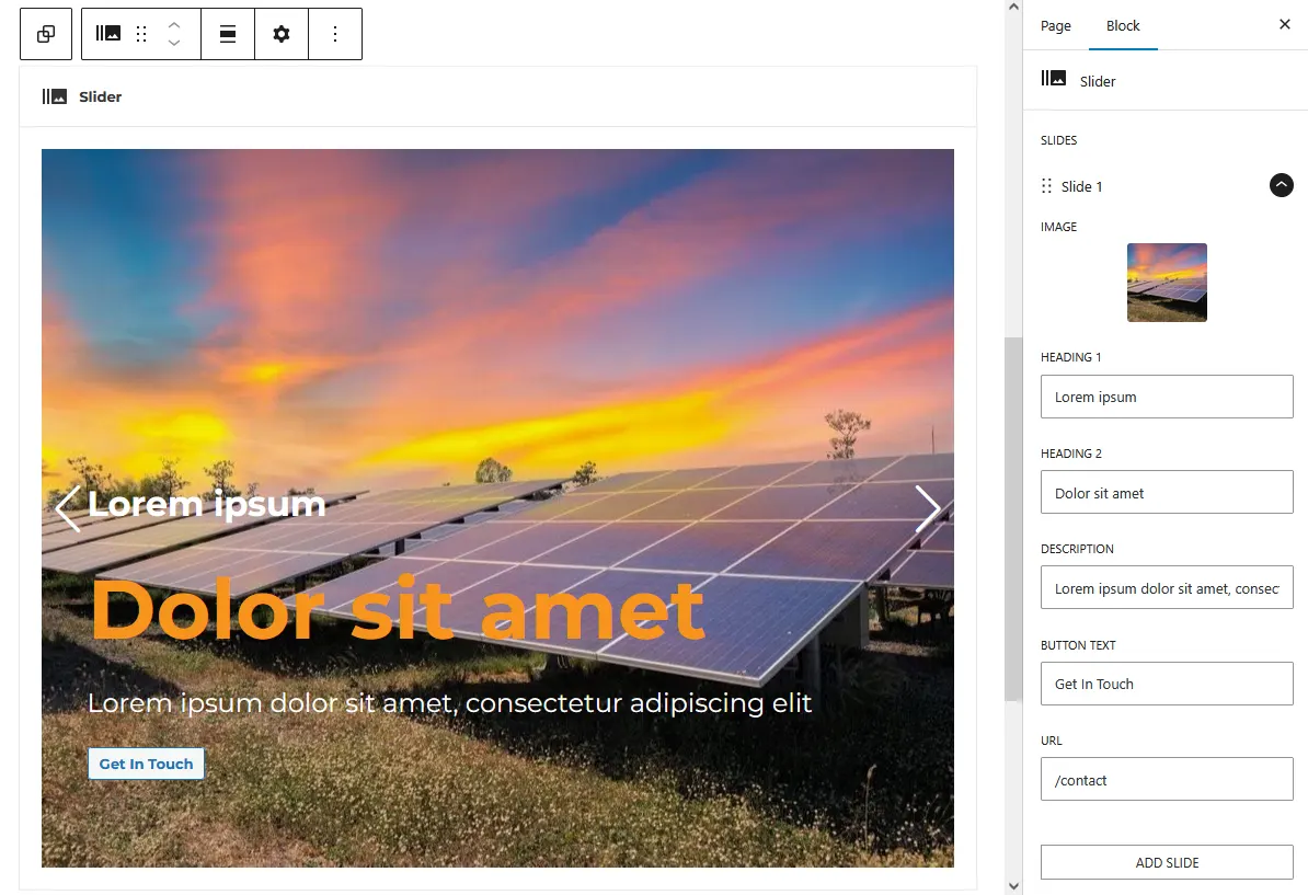
Install and activate the Lazy Blocks plugin. Then choose Add Block from the Lazy Blocks menu. Once you get familiar with Lazy Blocks you will find there are many ways we can set this up but for this article I will give the example of how I set it up to suit my particular needs.
- Name the block ‘Slider’
- Select any icon you like and optionally any category you want
- Click on Inspector Controls and add a new control with Label ‘Slides’
- For type of controller, choose Repeater
- For Row label, use ‘Slide {{#}}’
- For Add Button Label, use ‘Add Slide’
- Next add the child controls for the slides. These will be for the content that will make up the slide. For my slides I have an image, 2 headings, a description and a link button. Under your Slides control, click ‘Show Child Controls >’. Add one of type Image with label ‘Image’ and then 5 more of ‘Text’ type with labels ‘Heading 1’, ‘Heading 2’, ‘Description’, ‘Button text’ and ‘URL’.
- For the code output, I stick with default ‘HTML + handlebars’. Enter the code shown below (modify it to suit your needs). Note that the content inside {{ }} is our handlebars placeholders. Make sure these match exactly the names of the controls you added.
- Enable the ‘Single output code for Frontend and Editor’ option
<!-- Slider main container -->
<div class="swiper">
  <!-- Additional required wrapper -->
  <div class="swiper-wrapper">
    <!-- Slides -->
    {{#each slides}}
    <div class="swiper-slide">
      <img src="{{image.url}}" alt="">
      <div class="slider-overlay"><div class="overlay-inner">
        <h3>{{heading-1}}</h3>
        <h2>{{heading-2}}</h2>
        <p>{{description}}</p>
        <a href="url" class="button">{{button-text}}</a>
      </div></div>
    </div>
    {{/each}}
  </div>
  <!-- If we need navigation buttons -->
  <div class="swiper-button-prev"></div>
  <div class="swiper-button-next"></div>
  <!-- If we need pagination -->
  <div class="swiper-pagination"></div>
</div>
Step 5 – Add custom CSS to control the layout of the slides
You can add this in your main style.css file, your child theme’s style.css or you could even add a block specific stylesheet. Again this is just my example, adapt it to your own needs.
:root {
   --swiper-theme-color: white;
}
.swiper {
   width: 100%;
   height: calc(90vh - 186px);
   position: relative;
   min-height: calc(100vw / 3);
}
.swiper-wrapper .swiper-slide>img {
   width: 100%;
   height: 100%;
   object-fit: cover;
   object-position: center center;
}
.slider-overlay {
   position: absolute;
   display: flex;
   align-items: flex-end;
   justify-content: center;
   width: 100%;
   height: 100%;
   top: 0;
   left: 0;
   z-index: 8;
}
.swiper-button-prev,
.swiper-button-next {
   outline: none;
}
.slider-overlay .overlay-inner {
   width: 90%;
   height: auto;
   max-width: var(--wp--style--global--content-size);
   padding: 80px 0;
   color: white;
}
.slider-overlay .overlay-inner .lazyblock-inner-blocks {
   width: fit-content;
   background-color: rgba(0, 0, 0, 0.2);
   padding: 30px;
}
.slider-overlay .overlay-inner .lazyblock-inner-blocks .wp-block-buttons {
   margin-bottom: 0;
}
.slider-overlay p {
   color: white;
   font-size: 24px;
   margin-top: 26px;
   margin-bottom: 26px;
}
.slider-overlay h3 {
   color: white;
}
.slider-overlay h2 {
   font-size: 76px;
   color: var(--color1);
   margin-top: 26px;
   margin-bottom: 26px;
}
@media (max-width: 1400px) {
   .slider-overlay h2 {
      font-size: 60px;
   }
}
@media (max-width: 600px) {
   .slider-overlay h2 {
      font-size: 48px;
   }
   .slider-overlay {
      align-items: center;
   }
   .slider-overlay .overlay-inner .lazyblock-inner-blocks {
      padding: 20px;
   }
}
Step 6 – Test and adjust
When you add or edit a page you should now be able to find your custom Slider block. So go ahead and try it out. Most likely you will find you will need to make some adjustments to the CSS.